How to Make a Heat Map to Visualize Your TikTok Shop Data
Before we get into the nuts and bolts of how to build a heat map, let’s talk about why it’s one of the most powerful tools in your arsenal as a TikTok Shop seller. A good heat map does more than just present data; it tells a story, turning rows of numbers into a clear picture that helps you make smarter, faster decisions to grow your brand.
Why Heat Maps Are a Game-Changer for TikTok Shops
If you’ve ever found yourself staring at your HiveHQ Profit Dashboard, lost in a sea of spreadsheets, you’re not alone. The sheer amount of data, from GMV and COGS to affiliate commissions, can feel overwhelming. This is exactly where a heat map shines. It cuts straight through the noise.
Think about it: you could see your entire product catalog's performance in a single glance. Bright, hot colors would immediately flag your bestsellers, while cooler shades would point out the underperformers that might be quietly draining your ad budget.

Uncover Hidden Opportunities in Your Data
Beyond just spotting your winners and losers, heat maps help you find deeper, more strategic insights. You can slice and dice your data to answer the big questions that actually drive growth.
For instance, a well-made heat map can help you:
- Pinpoint Peak Sales Hours: By plotting sales volume against the time of day and day of the week, you can find those golden hours when your customers are ready to buy. That’s gold for scheduling creator posts and flash sales.
- Identify Geographic Goldmines: A geographic heat map might show you that your products are flying off the virtual shelves in a specific state or region you never expected. Suddenly, you know exactly where to focus your ad campaigns for better results.
- Optimize Affiliate Performance: See which of your creators are truly moving the needle. A heat map comparing affiliate commissions to the GMV they generate makes it easy to spot your top partners and re-evaluate collaborations that aren't paying off.
Key Takeaway: Heat maps get you out of the weeds of raw numbers. They give you the power to see patterns and relationships, turning complicated analytics into clear, actionable intelligence.
This visual approach is absolutely critical in the fast-paced world of TikTok Shop. The platform is exploding, with US sales hitting $15.82 billion—a massive 108% YoY growth. The competition is intense. Data shows the beauty & personal care category led the charge with 18.65% of all sales.
And here’s the kicker: brands that effectively use data visualization tools have seen a 40% ROI uplift in their campaigns, partly by catching major trends like the $500M+ sales surge during Black Friday. You can dive deeper into the growth of TikTok Shop at aftership.com.
Learning how to make a heat map isn't just a tech skill; it's a real strategic advantage. It provides the clarity you need to manage inventory, fine-tune your marketing, and ultimately, boost your bottom line.
Getting Your TikTok Shop Data Ready for Analysis
Any great heat map starts with solid data. Think of it like cooking—you can't make a great meal with bad ingredients. Before you can get to the cool visuals, you have to roll up your sleeves and prep your raw TikTok Shop numbers. This part isn't glamorous, but getting it right is what makes your heat map genuinely useful.
First things first, you need to pull the data. Whether you're using a tool like HiveHQ's Profit Dashboard or just exporting directly from the TikTok Shop backend, your goal is to get a complete picture. Don't just grab one metric; you want a dataset that tells a story.

Exporting and Cleaning Your Data
Go ahead and export a report for a decent timeframe—say, the last 90 days. This gives you enough data to spot real trends without getting lost in the noise.
Make sure your export file includes these key columns:
- GMV (Gross Merchandise Value): The total sales value before any deductions.
- Units Sold: Simple enough—how many of each product you sold.
- COGS (Cost of Goods Sold): What you paid for each of those units.
- Affiliate Commissions: The cut you're paying out to creators.
- Product Category: How you group your items (e.g., "Tops," "Accessories").
Once you have the data in a spreadsheet, it's time for the cleanup. This is where you fix all the little errors that can throw your entire analysis off. For instance, you might find a row with a missing COGS value. You'll need to decide whether to fill it with an average or just delete that row entirely if it's too incomplete.
Consistency is your best friend here. I often see things like "T-Shirt" in one row and "Tshirt" in another. Your spreadsheet software sees those as two different things. Take a minute to standardize your category names so everything groups together correctly.
Structuring Your Data for Visualization
With your data all tidied up, the last step is to arrange it in a way your heat map tool can understand. You're essentially turning a long list of transactions into a grid.
Let’s say you want to see which products sell best each month. You’d set up your spreadsheet with product names down the first column (the rows) and the months across the top (the columns). The cells where they meet would contain the value you want to visualize, like total units sold or net profit.
Pro Tip: Don't do this manually. Use a pivot table. Both Google Sheets and Excel have this feature, and it’s a lifesaver. It can take your raw export and instantly summarize your sales by product and month, creating the perfect grid format you need for a heat map.
This structure is what transforms a jumble of raw numbers into a clear, aggregated summary. Putting in the effort to export, clean, and structure your data is the single most important step. Get this right, and you'll create a heat map that actually tells you something valuable.
Choosing the Right Heat Map for Your Business Goal
So, you’ve wrestled your data into shape. It's clean, organized, and ready to go. Now comes the fun part: figuring out what story you want that data to tell.
This is where you need to be selective. Not all heat maps are built the same, and throwing your numbers at the wrong one will just give you a pretty but useless picture. The key is to match the map to the business question you're trying to answer.
Are you trying to figure out where your customers are? When they buy? Or what they prefer? Each question needs a different type of heat map to really bring the insights to the surface. It’s a crucial step, and if you're ever unsure, a good data visualization guide on choosing the right charts can be a lifesaver.
For e-commerce, especially a fast-moving platform like TikTok Shop, I've found that three types of heat maps consistently deliver the most bang for your buck.
Geographic Heat Maps for Regional Insights
Let’s start with the classic: the geographic heat map. You've definitely seen these before. They paint data onto a map, using colors to show you where things are hot and where they're not. For understanding your market's physical footprint, they are absolutely essential.
For a TikTok Shop seller, a geo-map gets right to the point, answering questions like:
- Which states or cities are driving the most Gross Merchandise Value (GMV)?
- Are my affiliate campaigns actually working in the regions I targeted?
- Where should I concentrate my ad spend to get the best return?
Think about it. You might uncover a massive, untapped cluster of sales in a state you’ve barely paid attention to. That single insight is gold—it can reshape your next marketing campaign and tell you exactly where to put your budget.
Time-Series Heat Maps to Uncover Patterns
Next up is the time-series heat map, my personal favorite for optimizing day-to-day operations. This map is all about spotting trends over time. It usually plots days of the week against hours of the day, with the cell colors showing you the intensity of activity. It’s the ultimate tool for mastering your timing.
Use a time-series heat map to figure out:
- The absolute peak sales hours during any given week.
- If certain products have a weekend or weekday bias.
- The best time to have your creators post for maximum reach and engagement.
For example, you might see a consistent sales surge every Friday at 7 PM. That’s not a coincidence; it's a customer habit. This tells you exactly when to schedule a flash sale or have your top creator go live to ride that wave.
Categorical Heat Maps to Compare Performance
Finally, we have the categorical heat map. This one is perfect for comparing different items within a group. Instead of time or location, your axes are categories—think product names, affiliate creators, or marketing channels.
This map helps you compare apples to apples, visually showing which elements are pulling the most weight. For your TikTok Shop, you could create a heat map comparing your top 15 products against crucial metrics like units sold, profit margin, and return rate. This gives you an instant, at-a-glance view of not just what's popular, but what’s actually profitable.
Which Heat Map Should You Use for Your TikTok Shop
Choosing the right visualization can feel overwhelming, so I've put together a quick cheat sheet to help you connect your business goals to the perfect heat map. Think about the question you want to answer first, and then find the map that fits.
| Heat Map Type | Best For Answering... | Example TikTok Shop Goal | Required Data |
|---|---|---|---|
| Geographic | "Where are my most valuable customers located?" | Identify top 3 states for a targeted ad campaign. | Sales data with city/state/ZIP code for each order. |
| Time-Series | "When is the best time to run promotions or post content?" | Find the peak shopping hour to schedule a flash sale. | Order timestamps (date and time) for every transaction. |
| Categorical | "Which of my products or creators are the top performers?" | Determine which of your top 10 products are the most profitable. | Product name/ID, creator name/ID, units sold, GMV, profit margin, return rate. |
Ultimately, the best heat map is the one that gives you a clear, actionable answer to an important question. Start with your goal, and the right chart will follow.
Bringing Your Heat Map to Life: Two Practical Methods
Alright, we've talked theory and prepped our data. Now for the fun part: turning that clean TikTok Shop data from a spreadsheet into a visual story that actually means something. We're going to walk through two different ways to build a heat map. The first is a no-code approach perfect for beginners, and the second is for those ready to get a little more technical.
Don't worry, both examples use the same dataset we prepared earlier, so you can follow along no matter which path you choose. As you build your first one, remember that good data visualization for marketing is all about clarity and impact.
This flow chart is a great mental model for connecting your business questions—whether they're about regions, timing, or product performance—to the right kind of heat map.
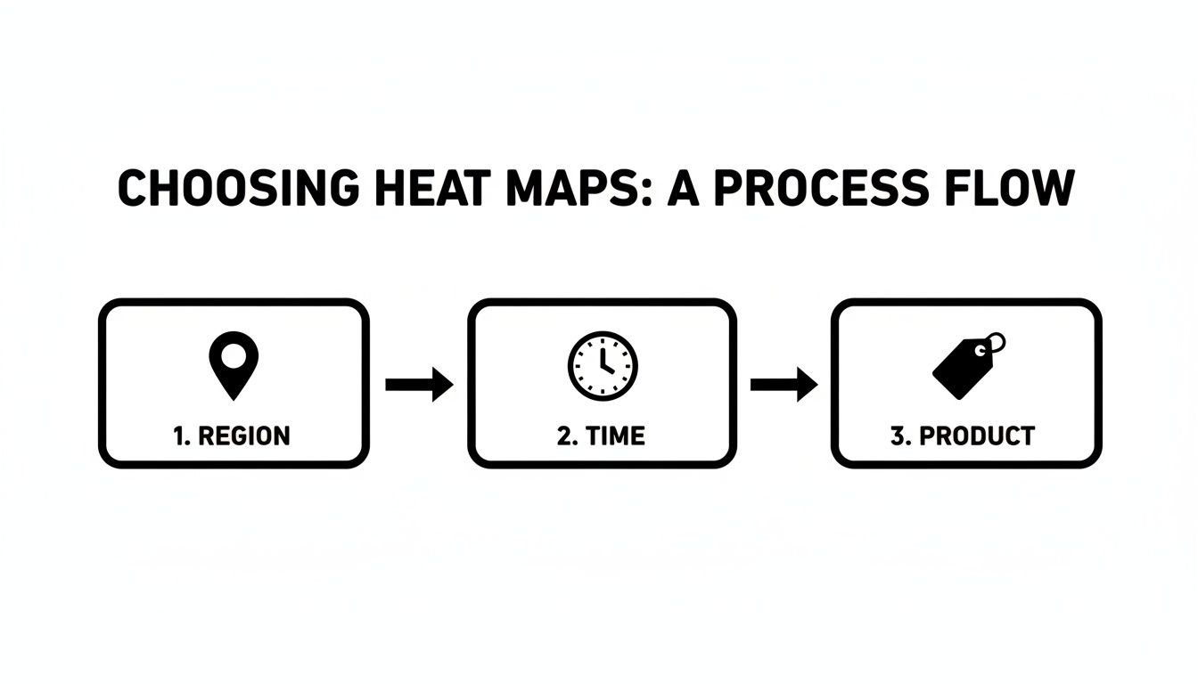
Think of it as a quick guide: you start with the question ("Where are my sales coming from?") and it points you straight to the best visualization to answer it.
The Quick and Easy Way: Heat Maps in Google Sheets or Excel
Honestly, the fastest way to get started is with tools you probably use every day. Both Google Sheets and Excel have a fantastic feature called conditional formatting that lets you whip up a solid grid heat map in seconds. It’s the perfect entry point.
Here's how simple it is:
- Select your numbers. Open up your pivot table. Click and drag to highlight just the numerical data—leave out the row and column headers for now.
- Find the formatting rule. In Google Sheets, you’ll find it under Format > Conditional formatting. In Excel, it’s on the Home tab, right under the Conditional Formatting button.
- Pick a color scale. You're looking for an option called "Color Scales." You'll see a few different color gradients. I find a simple two-color scale (like a light green to a dark green) is usually the clearest and easiest to read.
- Apply and you're done! Just click to apply the format. Your boring table of numbers instantly becomes a heat map. The highest values pop in a dark shade, while the lowest fade into a lighter one.
This method is my go-to for a quick analysis of categorical data, like comparing the monthly GMV of your top 10 products. The color-coded cells immediately guide your eyes to your best-sellers and the months they struggled.
For More Control: Building Heat Maps with Python
When you need more customization or you're wrangling a massive dataset, Python is the answer. Libraries like Seaborn and Plotly give you incredible control over every little detail, from custom color palettes to annotations. Yes, it involves a bit of code, but it's more straightforward than you might think.
The real power here is the ability to create more advanced visuals, like geo-heat maps. For a platform like TikTok Shop, where global GMV hit a staggering $26 billion in just the first half of the year, this is huge. A geo-heat map could instantly show you that Southeast Asia is on fire, with Thailand leading at $512.79M (25.84%) and the Philippines right on its heels at $500.51M (25.22%). You could build a similar map for your own data with a simple Python command.
To get started with a basic grid heat map in Python, you'll first need to install the libraries if you haven't already (pandas to handle the data and seaborn to do the plotting).
From there, the code is surprisingly simple:
- Load your data. First, import the libraries and load your CSV file into a pandas DataFrame.
- Pivot the data. Use pandas to structure your data into that familiar grid format, exactly like we did in the spreadsheet.
- Generate the heat map. A single line of code—
seaborn.heatmap()—is all it takes to create the visualization.
The image below gives you a feel for what a heat map from the Seaborn library looks like, with the numbers right there in the cells.
This example shows how each cell's color and annotated number represent a value, making patterns jump right off the screen. With Python, you can fine-tune everything—from the color map (cmap) to adding those numerical values inside each cell for extra clarity.
Turning Visual Insights into Profitable Actions
Making a heat map is one thing; knowing how to read the story it tells is where the real value kicks in. A good visualization doesn’t just spit data back at you—it makes you ask questions. Better yet, it helps you find answers that can directly grow your business. This is how you build a bridge between a colorful chart and a smarter strategy.
Let's say you just created a categorical heat map to compare your top products. You spot a deep red cell where your "Classic Black Tee" and "Total Sales" intersect. Awesome, it's a bestseller. But then you look over at the profit margin column for that same tee, and it's a pale, cool blue. It's barely profitable.
This isn't a dead end. It's a massive flashing sign pointing you toward an opportunity.
Translating Colors into Concrete Decisions
That simple color contrast tells you your most popular product isn't actually your biggest moneymaker. What's next? Maybe your Cost of Goods Sold (COGS) is way too high, or you're blowing your ad budget pushing that one specific shirt. The action becomes crystal clear: it's time to dig into that product's cost structure.
Can you find a new supplier? Could you bundle it with a higher-margin accessory to lift the average order value? This is how you turn a visual cue into a profitable move. You stop looking at colors and start diagnosing the health of your business.
Here are a few more common scenarios and the actions they should spark:
A Geographic Hotspot: You notice a surprising sales spike on your geo-map, lighting up a random mid-sized city you've never targeted.
- Action: Take a slice of your ad budget and aim it directly at that location. Even better, build lookalike audiences based on the customers there to find more people just like them.
A Weekly Sales Lull: Your time-series map shows a consistent dead zone every Wednesday morning.
- Action: This is your chance. Schedule an exclusive flash sale or a creator-led live event to run right in that quiet window. You can turn your weakest time slot into a powerful engagement opportunity.
Underperforming Affiliates: Your categorical map comparing creator performance shows two affiliates with high commission payouts but pitifully low Gross Merchandise Value (GMV).
- Action: It's time to re-evaluate those partnerships. The data gives you the confidence to either renegotiate their commission structure or cut them loose and reinvest that cash in your top performers.
Key Insight: Don't just hunt for what's working—actively search for the mismatches. A heat map's real power is in highlighting where your effort (like ad spend or commissions) doesn't align with your results (profit or GMV).
A Real-World Example with TikTok Shop Trends
Think about the absolute explosion of TikTok Shop. Its global GMV shot up from $1B to $33B in just a few years, with US monthly sales now consistently hitting over $1B.
Imagine creating a time-series heat map, either in a simple spreadsheet or with Python's Plotly library, to visualize these trends. You'd see categories like beauty products ($370.09M) and womenswear ($284.86M) glowing red-hot during major events like Black Friday, which saw a 50% jump in shoppers and cleared over $500M in sales. (You can dig into more of these TikTok Shop statistics at marketingltb.com).
For your own store, this isn't just trivia. It’s a roadmap. It tells you not to run a generic holiday sale, but to use your own heat map to see which of your beauty items popped during the last sales surge and then put all your muscle behind promoting them next time.
The goal is always to get from broad industry trends to specific, money-making steps for your own products. Your heat map is the tool that makes that translation happen.
Common Questions About E-commerce Heat Maps
As you start diving into heat maps for your e-commerce data, a few questions always seem to come up. Trust me, I've seen them all. Getting these sorted out early will save you a ton of headaches and help you make visualizations that are actually useful, not just a splash of color.
Let's walk through some of the most common sticking points. We'll clear up the confusion so you can get back to what matters—using your data to make smart moves and grow your shop.
What Are the Best Free Tools to Make a Heat Map?
Good news: you don't need to shell out big bucks for fancy software to get started. In fact, some of the best tools are probably already on your computer.
- Google Sheets & Microsoft Excel: Seriously, don't sleep on these. For grid heat maps, they're fantastic. The built-in conditional formatting is a breeze to use and perfect for visualizing things like product performance by month. No code required.
- Tableau Public: If you're ready for a step up, this is the free version of a seriously powerful business intelligence tool. It has more of a learning curve, but the payoff is huge. You can create much more advanced, interactive visuals, including detailed geo-maps.
- Python (with Seaborn & Plotly): For anyone comfortable with a little code, Python is the gold standard. Libraries like Seaborn and Plotly give you complete creative control and can chew through massive datasets straight from your e-commerce platform without breaking a sweat.
How Much Data Do I Need for a Useful Heat Map?
This is the classic "it depends" question, but I can give you some solid guideposts. You don't always need a mountain of data to spot a meaningful pattern.
If you're trying to analyze daily sales trends, you’ll want at least a few months of data to work with. This helps you see real patterns and avoid making big decisions based on one random good week. But for something like comparing product categories, even a single month of sales across 10-20 products can be enough to clearly show you who the winners and losers are.
The real secret isn't volume; it's consistency. Focus on getting clean, well-organized data. Start with what you can easily pull from your HiveHQ dashboard or TikTok Shop Seller Center. A few thousand rows of good data will reveal more than a million rows of messy data ever will.
What Are Common Mistakes to Avoid When Making a Heat Map?
Oh, I've seen some doozies. The number one mistake is a bad color scheme. Your goal is clarity, not modern art.
Stick to intuitive color gradients, like a single color going from light to dark. This makes it instantly obvious what's high and what's low. Please, avoid the "rainbow" palette—it's visually jarring and makes it incredibly difficult to compare values accurately.
Another big one is forgetting to normalize your data. Let's say you map raw sales numbers by state. You'll probably just discover that California and Texas buy a lot of stuff. Not exactly a groundbreaking insight, right? A much smarter approach is to map a metric like "sales per capita" or "conversion rate." Now that tells a story.
Finally, don't try to cram too much in. If you have 100 different products, a heat map will just look like a blurry mess. Instead, group them into 10-15 logical categories first. The result will be cleaner, more readable, and far more insightful.
Ready to stop guessing and start making data-driven decisions? The HiveHQ Profit Dashboard gives you all the clean, real-time metrics you need to build powerful heat maps and uncover your most profitable opportunities.